Character Design is a fundamental building block in animation and many other areas.
Let’s discover what is Character Design, how to do it well and how you can start (and thrive) with a career in this field.
So, first things first…
What is Character Design?
Character design is the process of creating character concepts for print, film, books, comics, games, or any other visual media. It can also include background character designs for use in set and level design within video games. The character’s conception and development are generally credited to a team of production members including character concept artist(s), character modeler(s), texture artist(s) and character riggers.
The common misconception is that it’s just drawing. But there’s much more to it. Principles like colour theory, shape language, and even general psychology; all help an artist to create an effective character design. In turn, character design all helps to tell the story.
How to make good Character Design?
At its core – Great Character Design is clarity and simplicity. Although that may seem counterintuitive – less really is more when it comes to creating high quality and memorable characters. This theme is present throughout the article.
However, as you will see – despite the principals and best practices, there is a degree of subjectivity to character design. Not everyone is going to love or hate the look of a given design. (And they never will!)
What are the most Important parts in Character Design?
Generally speaking, great character design can be broken down into 3 main areas
- Silhouette
- Colour palette
- Exaggeration
Let’s look at these in Greater detail:
1) Silhouette
Silhouette is a vital first step to character design. Serving as the character’s outline – it conveys basic character attributes. It’s used to conceal character design changes whether they be subtle or drastic between concept and finalization.
An important consideration in industry is that a character should be recognisable and distinguishable from their silhouette alone.
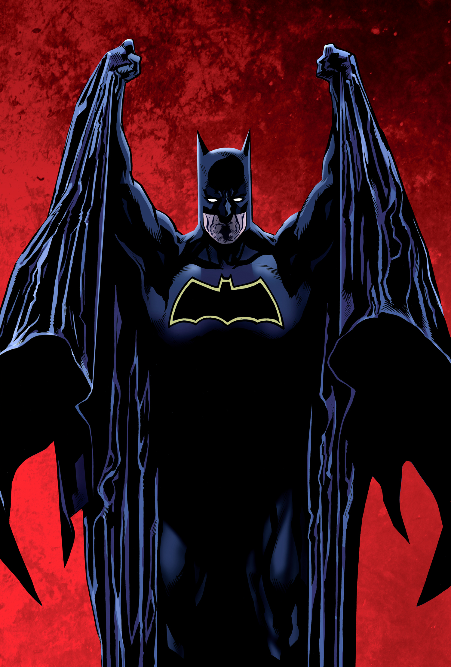
Think Batman, Super Mario, Marge Simpson. You would probably recognise them all by silhouette alone.
Below is a process for designing characters through silhouettes.
Shape Language in Silhouettes
At this stage with Silhouettes – Thinking about Shapes with your characters is important. However, it’s not just the ability to know different shapes (square, triangle circle etc) but what those shapes represent. In the same way – you can know the letters in the alphabet -but by themselves, they don’t necessarily mean much. It’s when you put them together and in context – that you have meaning in words.
So, what do we mean with shape and meaning? Let’s take 3 classic foundational shapes. All of which have different psychological meanings and representations.
Circle – often represents positivity, softness, and innocence. Often this might be used more for cute animals or kids in an animation piece.
Square – can represent stability but also a character who is stubborn or rigid. Many memorable hero type characters follow this shape broadly.
Triangle – this can represent danger, edginess, speed and a more nimble type of character. Also, depending on if it’s upward they can represent stability and power whereas downwards is more unstable.
Here is a greater breakdown of shape language in character design.
So, what shape do you have in mind for your character? Next up from Silhouette is the integral stage of colour palette.
2) Colour Palette
Like shapes – colours have different meanings and symbols. Choosing the right colours can convey character mood, character traits and character story.
For example, in Disney’s “The Little Mermaid,” Ariel is a character who is cheerful and full of life with bright colours to represent this. Contrast that with say Batman – it’s a more serious and sombre tone.
Often when it comes to character design – it’s best to minimise the amount of colours associated with a given character (again simplicity usually works best).
So, what do colours generally represent? In summary:
- Red: Passion, Love, Anger
- Orange: Energy, Happiness, Vitality
- Yellow: Happiness, Hope, Deceit
- Green: New Beginnings, Abundance, Nature
- Blue: Calm, Responsible, Sadness
- Purple: Creativity, Royalty, Wealth
- Black: Mystery, Elegance, Evil
- Gray: Moody, Conservative, Formality
- White: Purity, Cleanliness, Virtue
- Brown: Nature, Wholesomeness, Dependability
- Tan or Beige: Conservative, Piety, Dull
- Cream or Ivory: Calm, Elegant, Purity
Source: Smashing Magazine
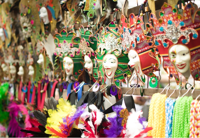
It makes sense. The brighter colours can be lively and exciting whereas darker colours can be somewhat more mystic or dramatic. And not only can colours represent personality types and traits – but also broader cultures and geographical areas.
When it comes to colour in your character design process – it’s important to consider 3 main factors beyond the general meaning and feelings of colours. These are
- Hue
- Saturation
- Brightness
Hue
This is synonymous with colour and is essentially dependent of the wavelength of light being reflected or produced. Different hues therefore can signal different moods and character traits.
Saturation
This is essentially how intense or pure the hue is. A colour with little to no saturation appears as medium Gray. So higher saturation is brighter, lower is duller. A character with high saturation tends to look more active than one with low saturation.
Brightness
This is the relative degree of black or white that has been mixed with a given hue (or colour). Naturally adding black makes it darker whereas white makes it lighter.
Although it’s important to consider all these factors –there is still a degree of subjectivity when it comes to colour. One person can perceive that colour and thus the elicited feeling somewhat differently than the next person. That said, the above are good guidelines to go by.
In a nutshell – think of colour (just like shape language) as part of telling the story. They all in their own way, help to tell the story of the character.
After Colour – the next and final key step of Character design is Exaggeration.
3) Exaggeration
Here the core objective is to make the character relatable and recognisable on an emotional level.
The key is interpreting reality through the lens of a human being. How does the viewer perceive this character? Is the body language and facial expressions revealing the emotions of the character?
One of the great things about character design (and animation in general) is that we have the power to exaggerate these features to really convey the emotion. (While in real-life it can certainly be done… but it’s often not as obvious)
In Scott McCloud’s renowned book – Understanding Comics, he talks about a technique in illustration called “the masking effect.” The basic concept is that people want to see themselves in other things. So, if a character is somewhat more simplistic looking – we are more likely to project ourselves onto the character. Whereas an overly detailed looking character would be harder to identify with, as it’s like another person (and thus not possibly ourselves).
The point here, is not to avoid details – but by using simplicity as a basis you can use to easily create readable features to convey the emotions and feelings.
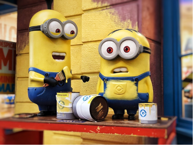
As below -the 2 characters emotions are obvious, but at the same time, they could be any person which makes them ‘relatable’.
So, what are some of the main things to consider in Exaggeration? (Note all 3 helps tell the story)
Pose
Just like human beings – our pose says a lot about us. A Slouched down pose can signal an introvert whereas more open body language can signal confidence and more of an extrovert.
Body Variety
In real-life there are many body shapes and sizes. For character design, we can exaggerate the body type to convey the character better and ultimately amplify the story. Think super-heroes. In respect to non-animation – they will be exaggerated in size to project this look and feel of strength and power.
Appeal
Characters bodies are broadly broken down into 3 main shapes. And the scale difference between these shapes, largely makes a character more appealing. If it’s too perfectly symmetric and equal – it could come across as a little boring. Think dynamic spacing to create appeal.
The Secret to Great Exaggeration?
Ultimately to convey exaggeration and bring your characters to life – you need to be a student of life itself. And that includes the movement and reactions of people, animals etc. By cultivating this curiosity – you will develop a solid understanding of what great exaggeration looks like in character design.
How to Design Characters? Further Tips
Getting the silhouette, colour and exaggeration down are the building blocks to great character design. However, it’s important to not just focus on the technical aspects, but also to cultivate the right mentality.
So, what do you need to do?
Be an Observer of real life
As above, by observing and critically thinking about the movement and facial expressions of people (and animals) … you hone your skills for identifying and depicting the nuances of a character’s emotions. So as obvious and vague as it sounds – go out and live life as that is the best way to meet, interact and ultimately observe these traits!
Study the Greats
What makes a character memorable? Is it the colour, the shape, or the general movement? By studying all the great character designs across a wide spectrum – you will acquaint yourself with quality work.
Feedback
In learning any skill – feedback is crucial. In his book ‘Thinking Fast and Slow’ – Psychologist Daniel Kahneman says the following “…to develop intuitive expertise depends essentially on the quality and speed of feedback, as well as on sufficient opportunity to practice.”
So, in other words, feedback = a chance to improve.
You can ask viewers for feedback right from concept art to final character illustration.
Another way to get this immediate feedback and set yourself up for success is through upskilling. While there are many great options like animation courses – if you want to focus on just character design… consider our tailor made short online course.
Introducing Character Design Course with Gary Erskine
This Character design course is tailor made to help improve your character design skills. You will cover the fundamental basics of approaching Character Design for games and animation, and also comics. We cover creating original characters for a variety of media.
And consequently, you’ll understand how shape and form, colours, textures and patterns, the use of silhouettes, current and historical references, props and logos, all help to define your character.
Gary Erskine is the tutor for this short course. Gary has 30+ years’ experience working as an illustrator mostly for MARVEL and DC Comics, as well as many other comic industry publishers including Image Comics, Dark Horse and 2000AD. As the tutor – you can be assured that you’re getting the best guidance from a world-class professional.
Full Course details can be found here.
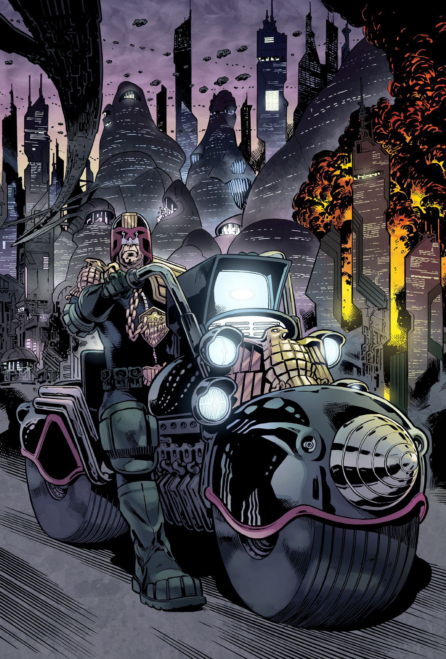
What is a Typical Character Design Process for physical Characters?
The character design process is usually rooted in character concept art. A character artist takes this character model or maquette, then makes a digital character model based on it for use in the end project. The texture artists paint the 3D model with textures, colours and shading to give it a more lifelike appearance. The character riggers construct the character’s skeletal and muscular systems, which are used to animate the character.
In conclusion on Character Design
Character Design (when done right) helps tell the story. It can be one of the most rewarding careers in animation and general design.
And while simplicity and clarity are often the main ingredients for success – it takes dedication and much practice at this craft to produce the highest quality. From Silhouettes right through to the exaggeration of the characters pose and movement — great character design is a valuable skill.
If you would like to know more about Character Design and how to improve this skill in your creative repertoire, please feel free to check out our courses.
